d video -->

A Better Substitute Process

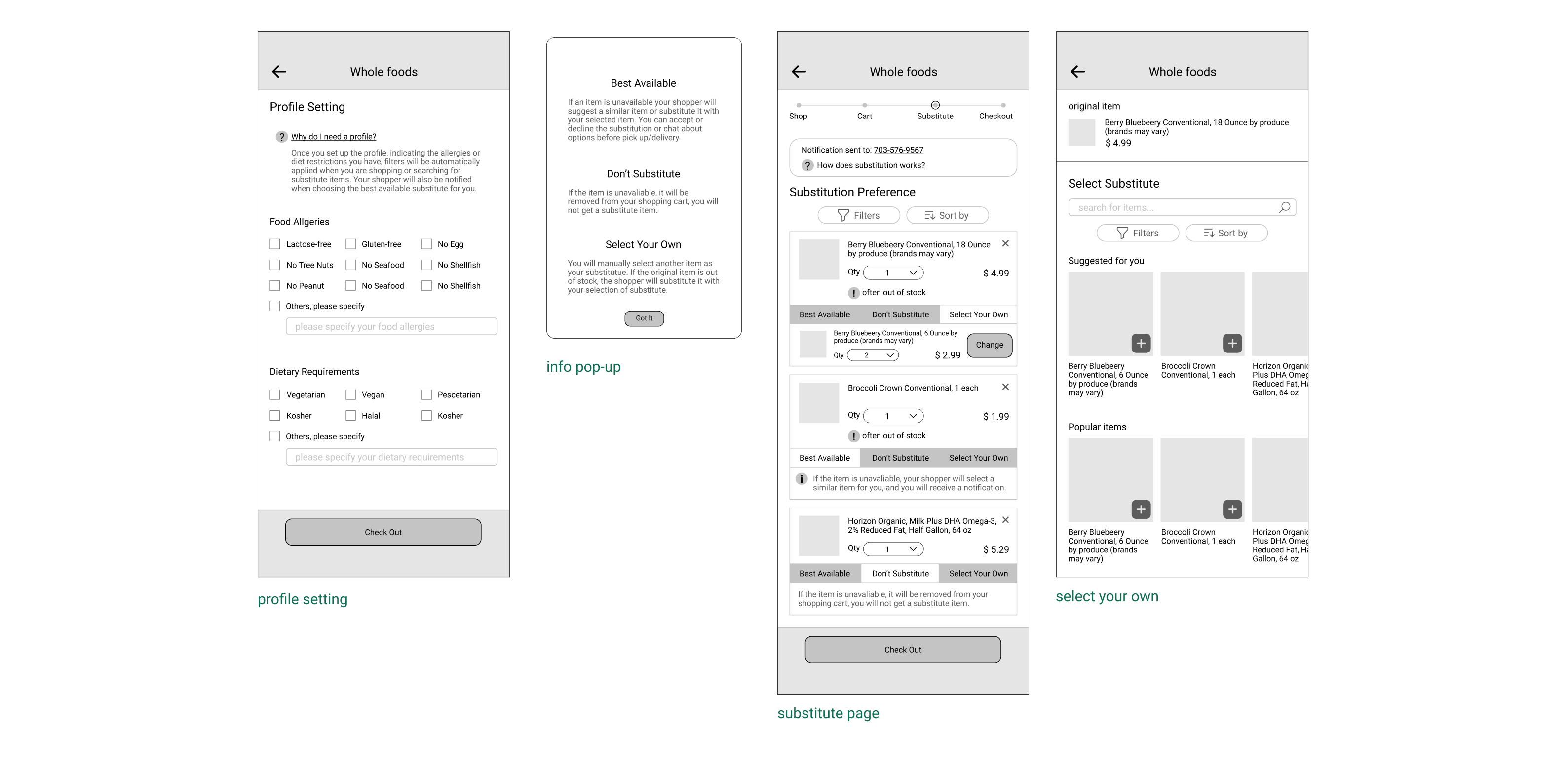
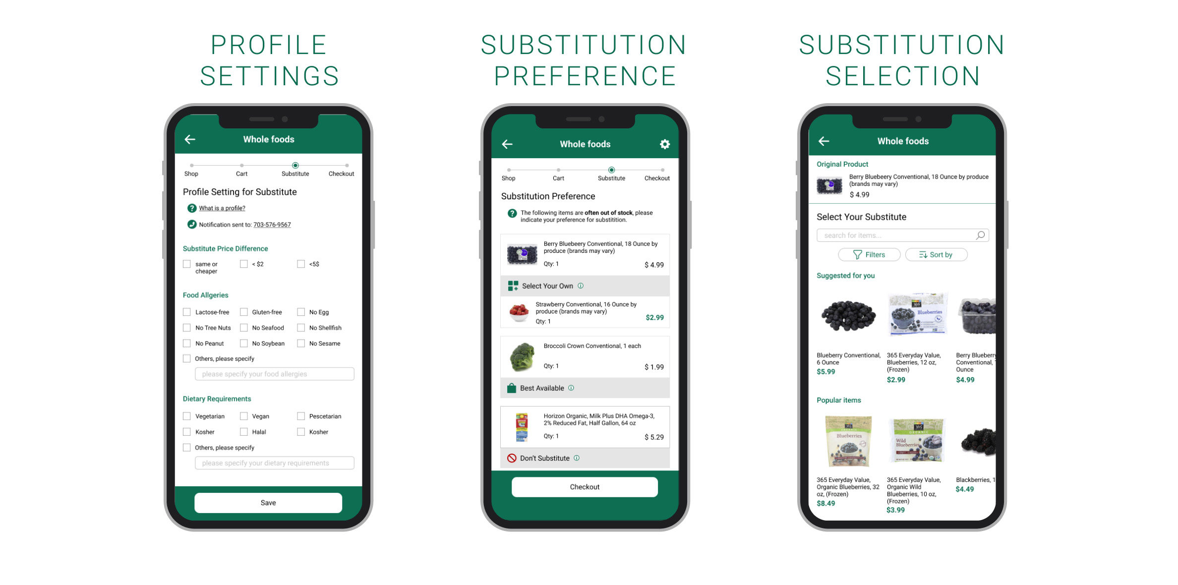
Since the beginning of the pandemic, people have faced significant challenges in adapting their day-to-day activities to remain safe and distanced. One area of life that has been radically changed is the act of grocery shopping. With more online grocery shoppers than ever before, the importance of these relatively new systems continues to grow. Our team partnered with Amazon Whole Foods to design a more user-friendly interface for the substitution process on both mobile and desktop. Our goal was to reduce costs for replacements, increase brand loyalty, and improve customer satisfaction. After a month of design and research we completed a high-fidelity prototype of the interface.


Design brief

Duration:

November 15th - December 1st 2020

Tools:

Figma, PS, AE

Collaborator:

Brady Baldwin & Tianyi (Meo) Zhang & Emily Zou


1. Where did you shop and why?
2. How do you select items you want to purchase?
3. How do you feel about your overall experience?


Research questions

Method

Using the pop-up research method, our team gathered quick insights about the current state of grocery shopping. In order to gain a better sense of the problem space, each team member selected at least one person who shops for groceries online.

Participants

Twelve people of various backgrounds

Research Goal

Understand customers current experience of online and in-person grocery shopping to figure out ways to reduce costs for replacements, increase brand loyalty, and improve customer satisfaction.


1. People want to get items right the first time for both in-store and mobile pick-up orders.
2. Substitutions are a pain to choose and people disliked getting surprises in pickup orders.
3. Users want the process to be efficient and enjoyable.


Key Findings

Problems

1. Many users are new to the online process and forced to use services. The app and website are most frusturating when users feel a lack of control over their shopping decisions.
2. Users don’t know if their tiem will be in stock and don’t know what the replacement will be.
3. The current substitution process have too many steps. Users complain the process is too time-consuming.

Design Goals

1. Maximize what the user can decide so that they are less dissappointed in the outcome.
2. Being transparent with users. Show which cart items are frequently out of stock so they can prioritize their substitute selections. Make a clear, uncluttered, intuitive design that users can interpret easily so they understand the process.
3. Make the substitution process a fast and painless experience.

Solutions

1. Letting users filter the substitutes to fit their dietary needs and monetary means so that they feel comfortable and secure with what is given to them.
2. Make a clear, uncluttered, intuitive design that users can interpret easily so they understand the process.
3. Keep the default substitute option as best availble to save them time when they want to shop quickly.


We mapped out each user’s personal journey as they navigated through the grocery shopping process to find commonalities and trends. We added categories to the class template to account for thoughts, feelings, and areas of opportunties to better put ourselves in the customer’s shoes.

Customer journey map


Mike is a 25 years old PE teacher who lives with his family. The pandemic made Mike afraid to shop in person. He is allergic to seafood. His goals are:
1. Learn how to shop groceries online to make sure the items right the first time.
2. Know what exactly he is getting each time.
3. Spend less time grocery shopping.

Persona


Based on the discussion, our team consolidated the design ideas into one low-fi prototype. We used one sketch as the template and collectively designed additional features and functions in Figma.

Low-fi prototype


In the class session, we presented our design sketches to two other teams for peer feedback. We conducted think-alouds with the prototype, helping expose some problems and general confusion within our design. Our peers also helped generate potential solutions to our outstanding issues. Here are some major findings:

Feedbacks for low-fi prototype


In reference of my user workflow map, I started to sketch out the first page of all the key parts. I want to make the copy each page as straight forward as possible, so user can easily follow the workflow. In addition, I try to make all the copy more conversational to engage user.

First mid-fi prototype


We returned to the class feedback crit session, having implemented the previous feedback and advanced our design to a new level of digital fidelity

First mid-fi prototype feedbacks


We returned to the class feedback crit session, having implemented the previous feedback and advanced our design to a new level of digital fidelity

First mid-fi prototype feedbacks


1. We simply the design. We removed unnecessary buttons like quantity.
2. Only showing cart items that are frequently out of stock so the user doesn’t waste their time selecting substitutes for items that will never need it.

Second mid-fi prototype feedbacks

We went back to test ten potential customers to understand how others viewed these changes. Overall our feedback here was very positive.

Second round user testing


Our final design takes the user through three screens that comprise the substitution process: Profile Settings, Substitution Preference, and Substitution Selection.

High-fidelity design


Even our interface is already uncluttered; the customers may not understand how to interact with the app. So we decide to add micro-interaction to make it easier to navigate. The motion will give users hints about what they can do.

Interaction & motion design


Our new UI solved the pain points with:
1. A saved profile section.
2. An uncluttered substitution list and a more robust substitution selection screen.
3. A saved substitute default feature base on customers' previous decisions.

Impact of our design for Amazon


  • Click me to see next project